
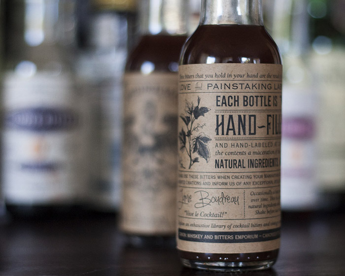
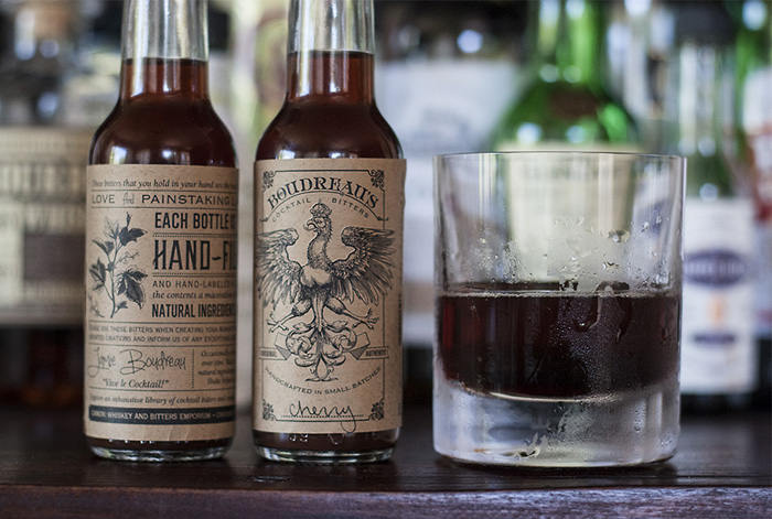
“This project was another chance for me to work with Canon Seattle’s famous Jamie Boudreau – award winning bartender, restaurateur, curator of the world’s best drink selection (an actual award, 2013) and great client. I was excited to have this opportunity to dress up his signature bitters with the premium label design they deserve. An embossed, common (master) label design with write-in varietal name is flexible and affordable, while at the same time lending a hand-made touch to these authentically hand-made bitters.”
“The original label was printed on a magenta-tinted, mirror-finish silver mylar stock that looked more at home in a Las Vegas Casino than behind the bar at Canon (I can provide photos if that helps). The new label – while still recognizable to loyal fans – is designed in a late 19th-century style more appropriate to the bar’s emphasis on pre-prohibition era whiskey and bitters – and with an uncoated kraft stock and authentic 1-color flexographic printing process to reflect the period’s actual printing technology. Most printers are pushing full-color digital printing and coated stocks without much regard for a designer’s concerns for tactile experience or period-correct ink usage. But to me, materials specifications were just as important as the design in the overall execution of this piece and it was worth digging a little deeper to get past the standard offerings and get what we really wanted.”
Designed by David Cole Creative, United States.


Featured on Package Inspiration
We are young team which works to inspire packaging designers every day! Our team select the best packaging of today and shares with you.
