
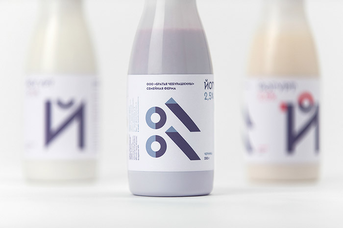
The family farm of Cheburashkini Brothers is a challenging project for the Russian market. Cheburashkini brothers are real people, who have restored four old farms in an ecologically clean Moscow region, transported highly productive European cow breed, and built up an ultramodern dairy factory.
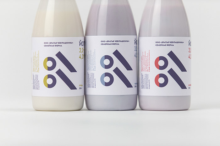
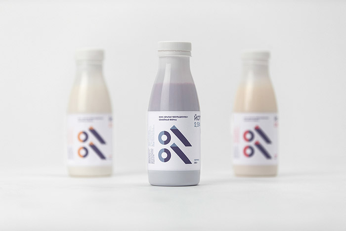
The packaging of dairy brands on the Russian market is often based on traditional visual codes such as pouring milk, images of cows, etc. We deliberately did not follow this path, because Cheburashkini Brothers is a new sophisticated farming culture with a huge involvement of an entire family. This is not just a business or a small family farm, it is a brand new format of farming, that requires a fresh design approach. Our target audience consists primarily of intelligent consumers with an affluence above average, who value the quality of a product as well as its design. Excluding the fixation on the market standards from our working process we have focused not on a creation of a logotype, or storytelling, but on the essence of the product, which has been reflected in a clean design with no excessive details. We met a juridical problem with a registration of the logotype. Our clients faced the problem with registration their own surname as a brand name because it was already used for famous russian animated hero named Cheburashka. Never the less Cheburashkini Brothers did not want to make abstract naming for brand because their surname stands for the quality of the product. Actually we decided to profit from this situation and got rid of the logotype on the products’ package. We are showing that the brand logo is not the essence of the product, the essence is the quality of it. We placed the Cheburashkini Brothers name on the back side of the package for customers to know the name of the company.
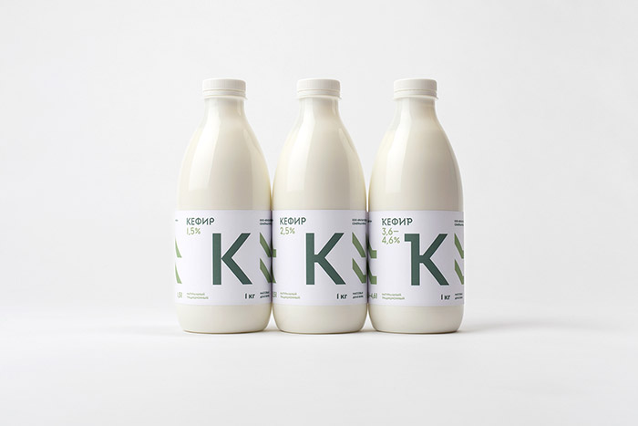
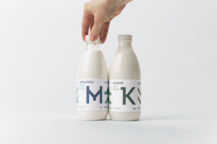
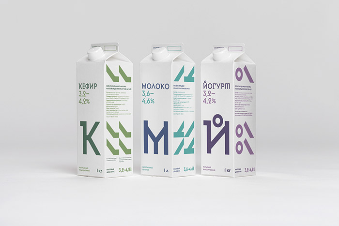
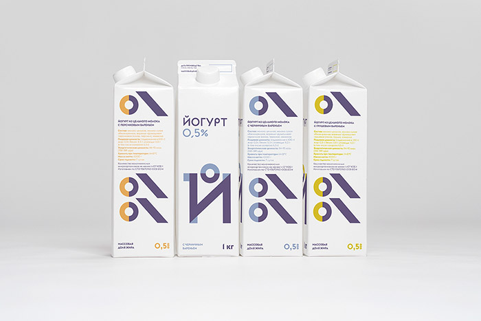
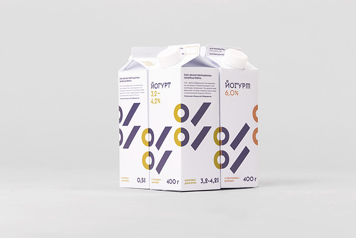
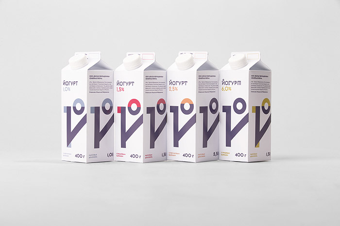
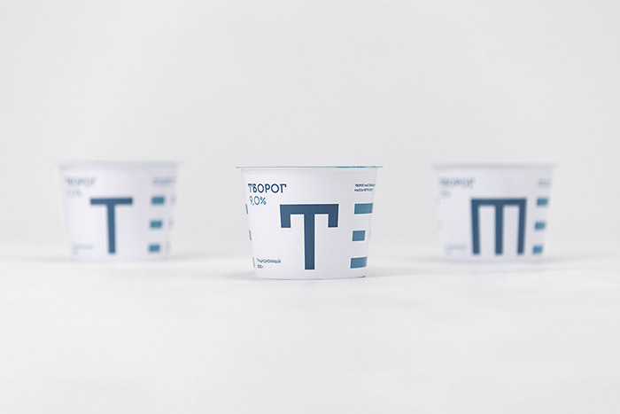
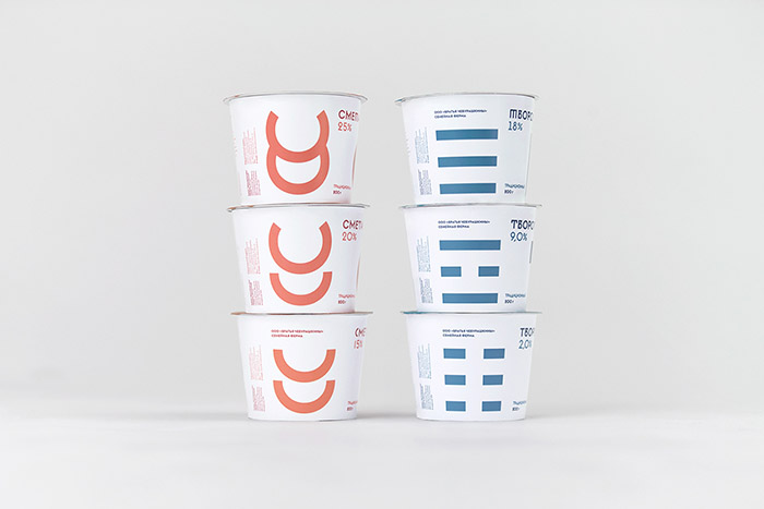
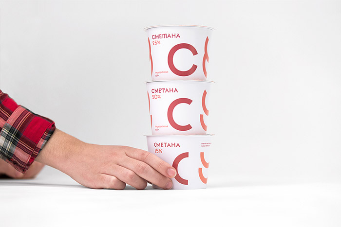
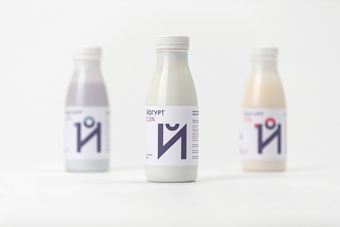
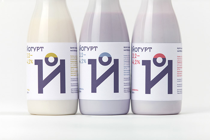
The main idea of packaging design is based on typography, where initial letters of products are central elements of the design. We have designed a display sans-serif typeface with a set of weights, and for the text setting we have used the Cyrillic version of Euclid typeface from Swiss Typefaces.
Our client controls all stages of diary production from seeding fields with grass for feeding to products transportation. The quality of the product depends on the quality of each stage of the production. We have found our inspiration in ancient Slavic symbols, which mean seed, grass, earth and other symbols of farming. Taking this experience into the consideration we designed system of symbols illustrating the whole process of farming and dairy production. This graphics appear as an additional element of the packaging design reflecting an agricultural theme. Graphics and typography are build on the same system. The same way as a plant grows from a seed to a flower, the graphics and letters evolve in the order of increasing fat weight. In addition, each product has been assigned with two distinctive colours, with a prime colour for letters and a supporting colour for the graphics.
Designed by: Ermolaev Bureau, Russia.


Featured on Package Inspiration
We are young team which works to inspire packaging designers every day! Our team select the best packaging of today and shares with you.

