
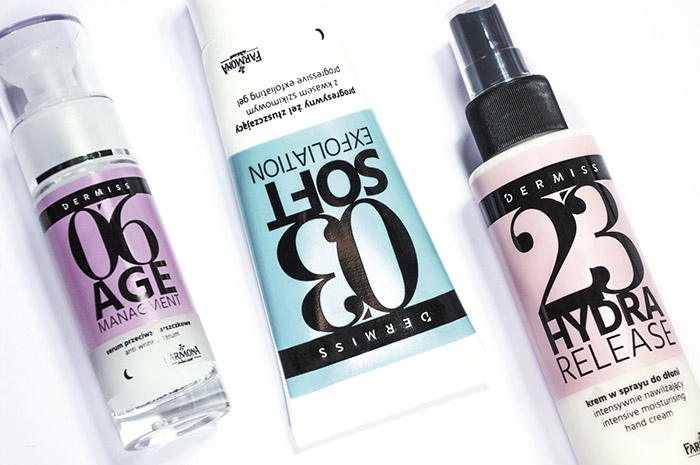
Dermiss is a new line of cosmetics that has been divided into steps adjusted to everyday skincare routine.
The packaging design by Brandy Design is based strongly on typography. Black, big numbers on the front communicate explicitly the chronological order of the steps, while the Bodoni font, similar to the one used in the logo of Vogue magazine, evokes the connotations with a feminine world of fashion and classic elegance. As a result, the packaging is not only well visible on a store shelf, but also embodies the marketing idea.
Beside the numbering, product types are also distinguished by the diverse, a bit dim color palette and the subtle appearance of the female body parts in the background.
Designed by: Brandy Design, Poland.


Featured on Package Inspiration
We are young team which works to inspire packaging designers every day! Our team select the best packaging of today and shares with you.

