
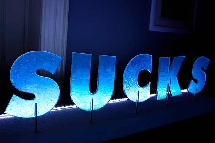
Design Sucks is an experimental project integrated in Experimenta Design 2013 Biennale with the theme “No Borders”. It’s the result of a partnership between Fluor Studio and Escola Superior de Hotelaria e Turismo do Estoril, where designers and chefs challenged the creativity when designing a new food product based on a similar creative methodology.
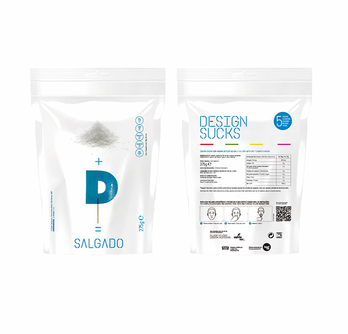
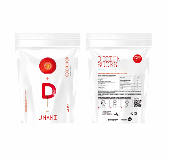
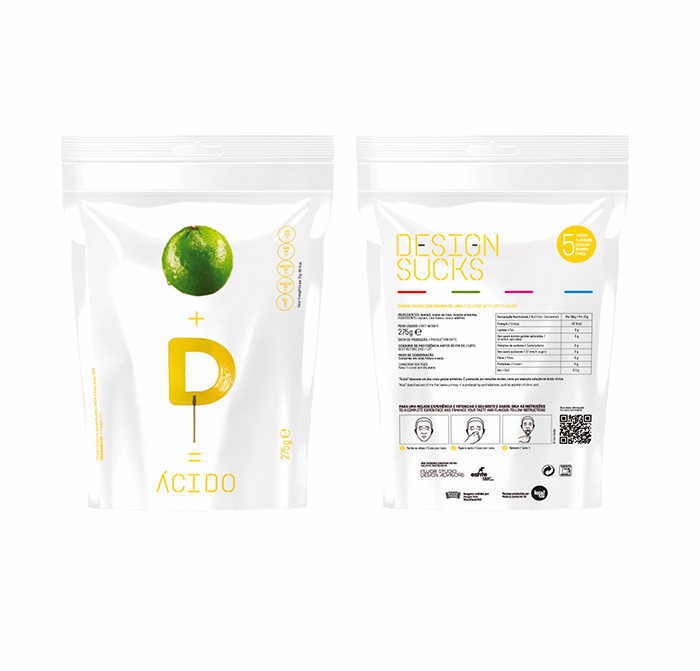
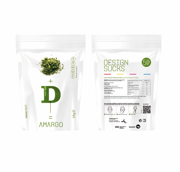
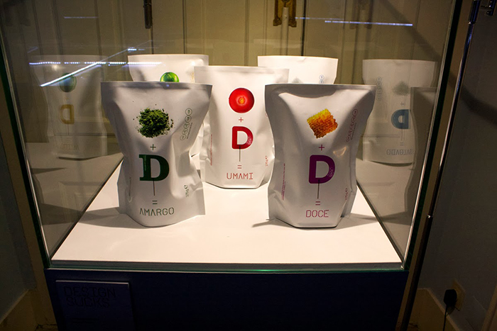
5 types of lollipop were developed with 5 different flavors, 5 different colors, corresponding to the 5 basic tastes: bitter, sour, salty, sweet and umami. This project contemplates two distinct stages, the first, which corresponds to the exhibition and performative effect, and a more complex subsequent stage corresponding to their marketing. The lollipops were designed to awaken the senses, tests were made to its resistance, sound (when when they in the mouth) and smell, and above all to its physiological taste that is the central focus of this project.
The use of typography took 2 reasons into account, firstly, as a vehicle for communication of the project itself, because is through the product that the name is revealed. On the other hand, because one of the principles, we explore how the form may or may not influence the taste of food. At the same time it would be interesting to explore this concept by which typography is constructed from other forms. The typography is a tool which assist us by their multiplicity and plasticity: from Futura by Paul Renner designed with basic angular shapes to Gotham Rounded From Futura by Paul Renner designed with basic and angular to Gotham Rounded designed with rounder shapes. Making use of creativity and innovation to conquer the visitors was the purpose of the exhibition, trying to unite and dissipate borders between design and cooking.
Design Sucks took shape through an exhibition at the National Museum of Sport in Lisbon, where giant lollipops are presented as parts of a museum exhibition, and creating a set of 5 packages that would be the extension of the project beyond the museum, part of marketing and commercialization stage.
The reactions to this project may be adverse, these are not flavors or tastes that are used in a lolly or in a candy. We may like it or hate it, but the initial idea was always surprise and teach somehow, how the taste works from a of physiological point of view. We can tell clearly, after the public opening held on the 14th of November, that there are tastes for all, and that preferences were not entirely unanimous. Some were fascinated by the sweet, but there were those who preferred the bitter and those who were surprised by the umami.
Designed by Flúor Studio Design Advisors, Portugal.


Featured on Package Inspiration
We are young team which works to inspire packaging designers every day! Our team select the best packaging of today and shares with you.
