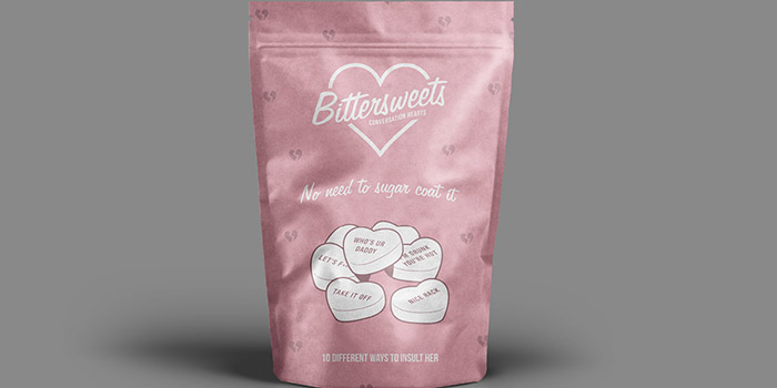
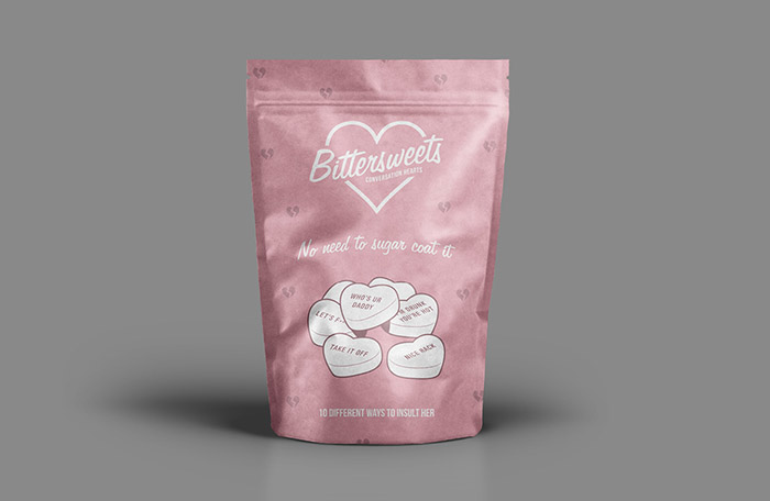
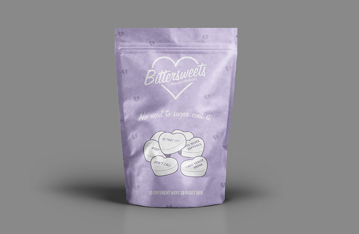
Bittersweets is a product branding and packaging concept developed for a student brief. The product was designed to be a humorous, not-so-romantic take on the retro candy Conversation Hearts. The products name was developed to convey the ill-mannered nature of the product, however it has been worked into a design that interprets a retro 1950s’ style. The slogan “no need to sugar coat it” was chosen as a way of summarising the products naughty message. The typographic choices for the logotype and the overall design was to create a vintage retro style with a modern influence, aiming to appeal to the young target audience. A constraint in the brief was that only two ink colours could be present, black and a Pantone colour swatch; the white packaging was used as a third colour. Pastel colours were chosen for the primary ink with black overlaid to create darker pastel hues. Overall, a moral conflict has been created with the choices in product name, visual style, and colour, adding to the humor of the product.
Designed by: Nicole Denton, Australia.

Featured on Package Inspiration
We are young team which works to inspire packaging designers every day! Our team select the best packaging of today and shares with you.
