Comet Cleanser is a well-known household brand known for its ability to clean deeply without scratching surfaces. When Comet first appeared on the market, the target audience were housewives who needed an extra hand with mundane chores. The brand has changed styles over the years starting with a bright pink bottle to the now easily identifiable green, gold and red can.
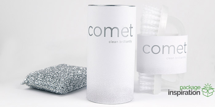
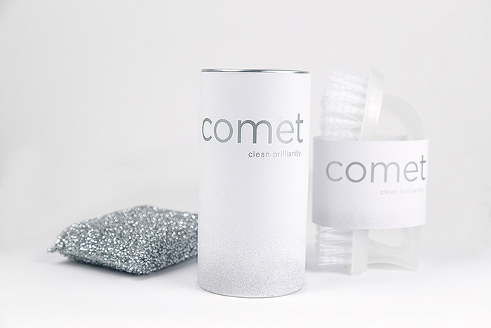
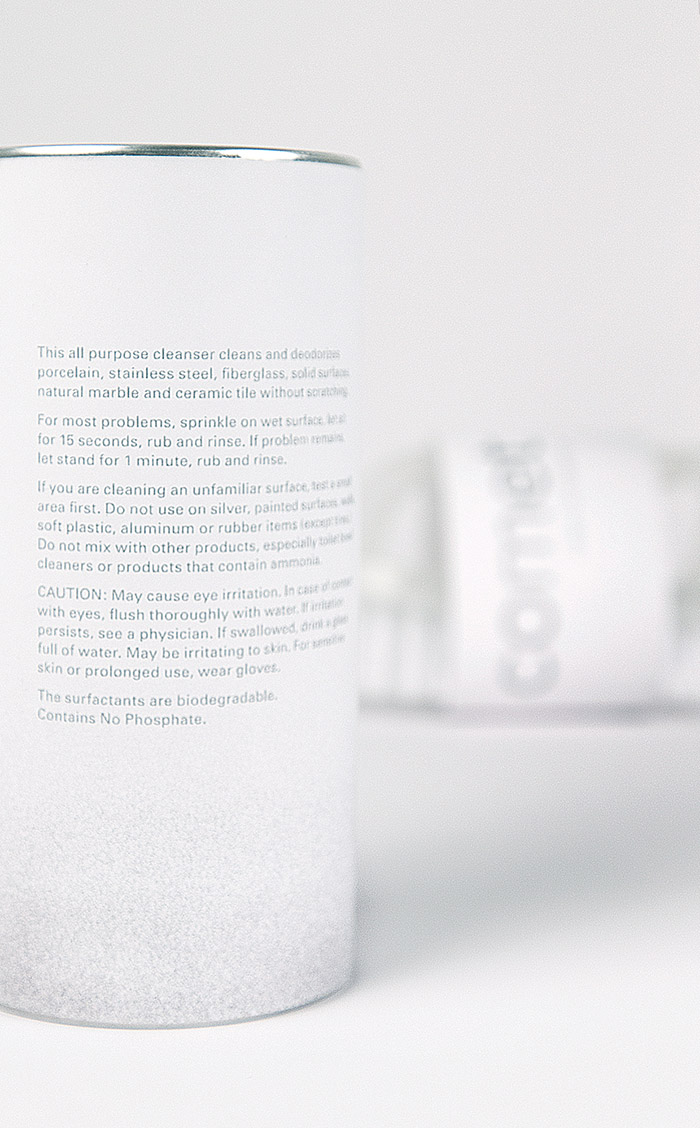
I chose to redesign the packaging for Comet for many reasons. One of which is because my mother uses Comet and she swears by its cleaning power. I also don’t believe a lot of people give Comet creditability due to its current design. My goal inPage Kilcoin, this brand shift was to elevate the brand to appeal to today’s modern adult. I kept the design very simple only utilizing white and silver as the primary colors and added a bit of a texture gradient towards the bottom of the can to hint towards the powdery nature of the product. I created the tagline verbiage “clean brilliantly” as a way to entice potential buyers.
*Disclaimer: This project is a school assignment and has not been presented to Comet headquarters.
Designed by: Page Kilcoin, USA.


Featured on Package Inspiration
We are young team which works to inspire packaging designers every day! Our team select the best packaging of today and shares with you.
