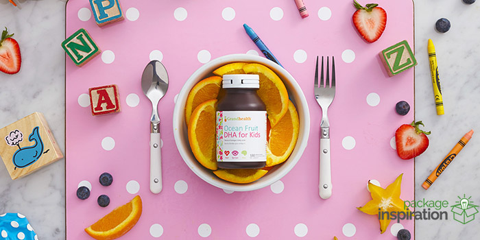
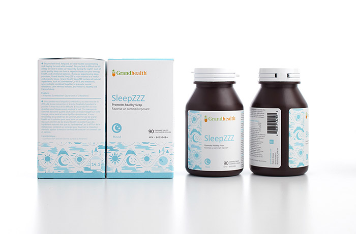
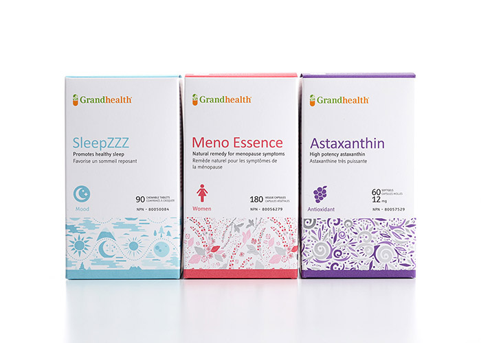
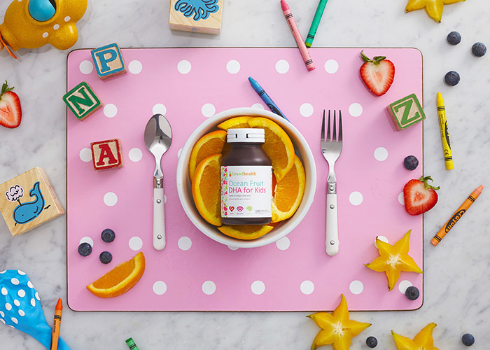
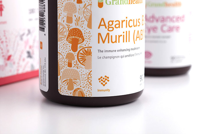
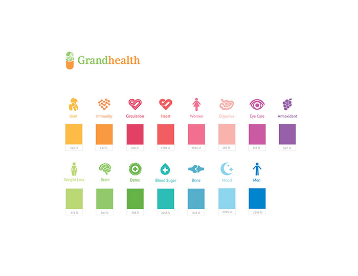
Family based vitamin brand Grandhealth evolved over the years and needed a new image that conveyed their wholesome and forward belief that positive change is the foundation to a healthy evolution. Their old packaging was a slew of miss-matched photos and illustrations. We contemporized their brand and overhauled the packaging to convey their growth and innovation as a health supplement provider. The first step was to redesign the family of bottles, formerly a harsh black bottle with masculine lines, we designed a friendly, rounded bottle family and dedicated a signature rich brown bottle colour. Next we set out to build and implement an intelligent colour coded iconography system to enhance consumer education and interaction and communicate across languages. The creative strategy was then applied to three sizes of labels adorned with emotion evoking custom illustrations that conveyed benefits and product sources in an artistic way. Lastly, a box was designed to break convention on shelf amongst an otherwise simplistic and type based competitive standard. The end result is a healthy and much needed shock to an unaddressed and confusing consumer category. Our goal was to take very complex and intimidating product information and translate it into a warm and inviting health solution for the every day consumer. Designed by arithmetic creative, a branding and packaging design studio located in Vancouver, Canada and working with clients located in the USA, Europe, China and Korea.
Designed by: arithmetic _, Canada.


Featured on Package Inspiration
We are young team which works to inspire packaging designers every day! Our team select the best packaging of today and shares with you.

