
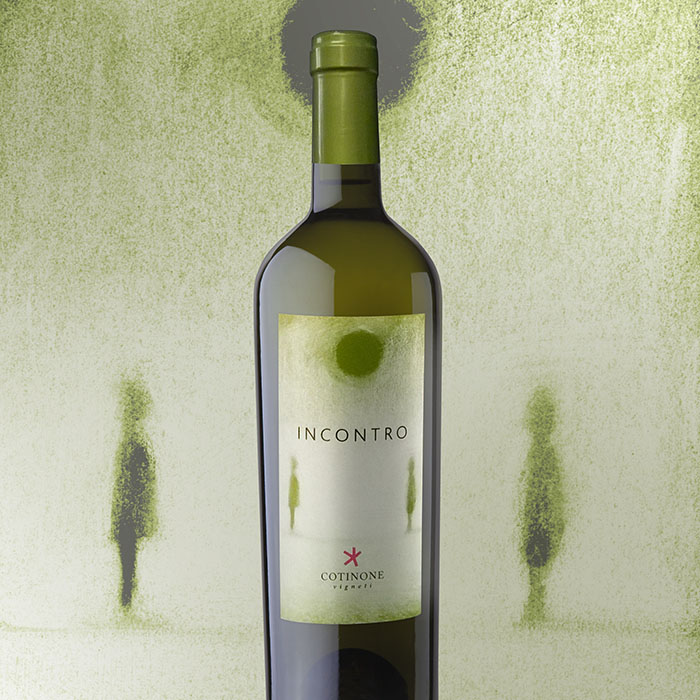
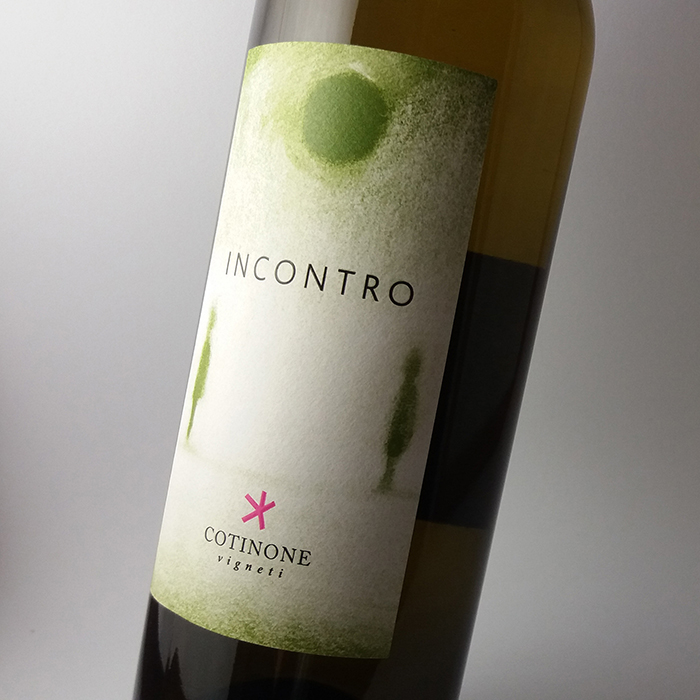
Delicate appeal and ethereal charm for label design project of Incontro white wine. The label’s focal point is the charcoal drawing, inspired by name of this wine and by its nature; in fact “Incontro” means blend between an Apulian native grape variety, such as Bombino Bianco, and an international variety, such as Chardonnay. To express freshness and lightness we have drawn with delicate strokes and we have used fair colors. The raised print highlights wine’s name and brand and it enhances the design project.
Designed by: EMMECIDUE, Italy.


Featured on Package Inspiration
We are young team which works to inspire packaging designers every day! Our team select the best packaging of today and shares with you.
