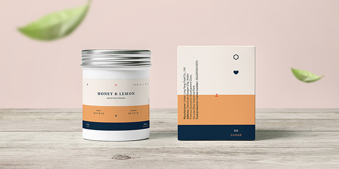
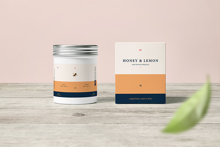
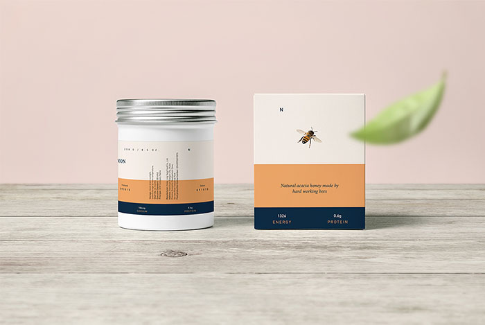
Miyu is a small shop in china selling homemade Honey-Fruit Tea. There tea is said to help getting smoother skin with each cup.
It was to create a outstanding combination between modern art and a organic-natural look. So the client wished. Sadly the production costs went to high for the small couple and they decided to go with a standard 1 label design.
So here i present you today a “Concept i wish would be real”.
The aspect was to create a mix between 2 styles which actually kind of reject each other. After a hard work of sketching and researching i’ve came to the final conclusion:
“A design is not only what we see but more of what we feel and touch”
This was the leading sentence i gave myself. So I’ve decided to go all natural and organic with label and box however new, modern and fresh with the actual bottle, as to keep all simple and clean. Only use what i got to and not more.
Contrast between colour and text was what i concentrated the most on.
In the end i came to use an actual cosmetic packaging redesigned into a organic look with a slight touch of modernism.
Concept & Design by: Tom Jueris
Logotype by: Tom Jueris
All right reserved by: Tom Jueris, United Kingdom.


Featured on Package Inspiration
We are young team which works to inspire packaging designers every day! Our team select the best packaging of today and shares with you.
