
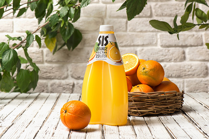
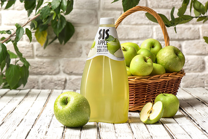
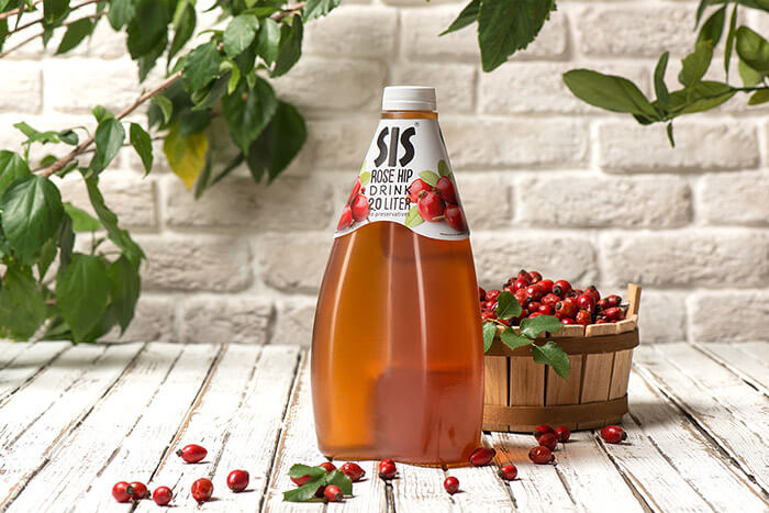
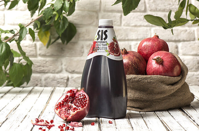
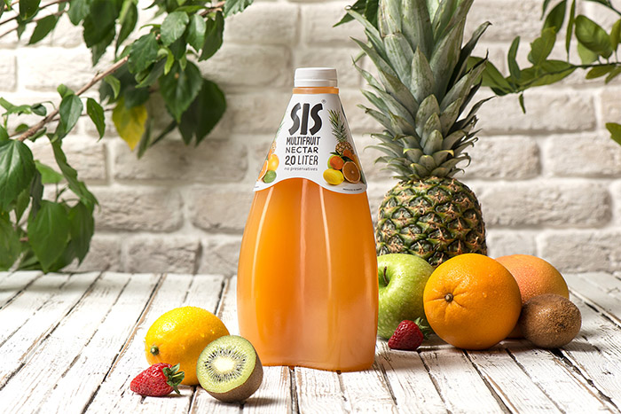
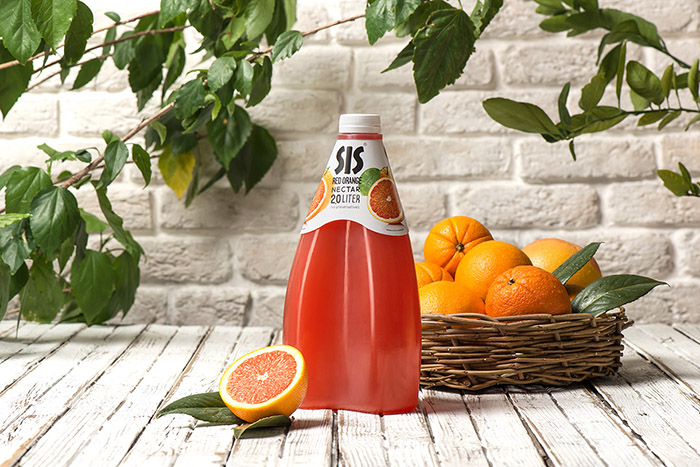
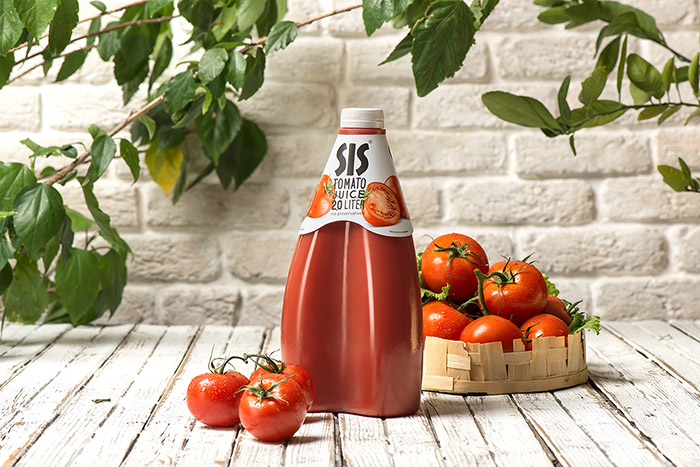
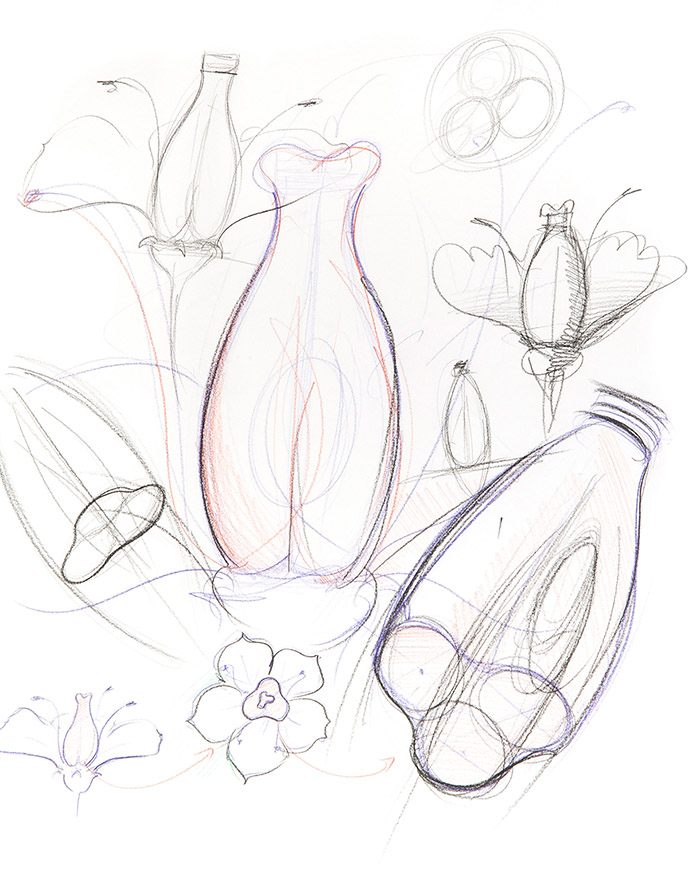
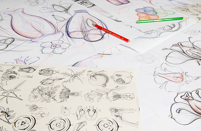
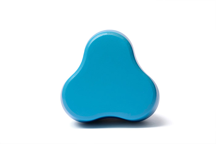
Working in bio mimicry principles the designer repeated one of the main structural parts of the flower and conceptualized the pistil as an optimal shape for a two – liter juice bottle.
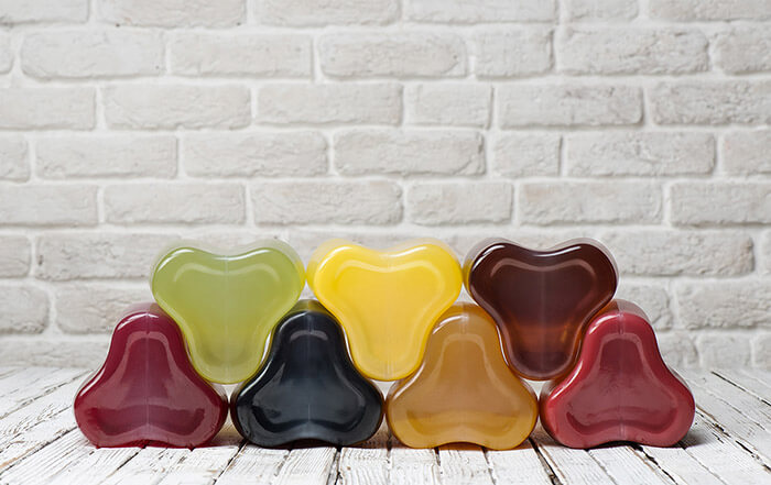
The pistil is the initial outflow, where the juice forms. Then it becomes a fruit, which in its turn ripens finally becoming juice. The natural color of the juice makes up the major part of the bottle space. In composition with white label and black logo, it makes the bottle shelf shout, different from the competitors and solves the problem of merchandising.
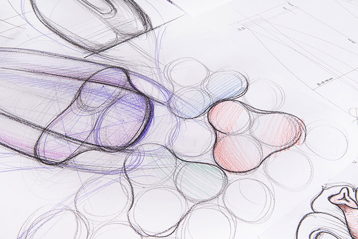
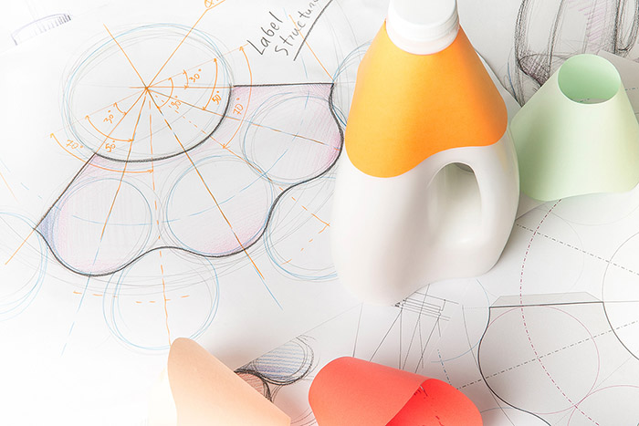
Inspired by natural shapes, the bottle is structured on the strength of geometrical regulations and keeping the geometrical commeasurement.
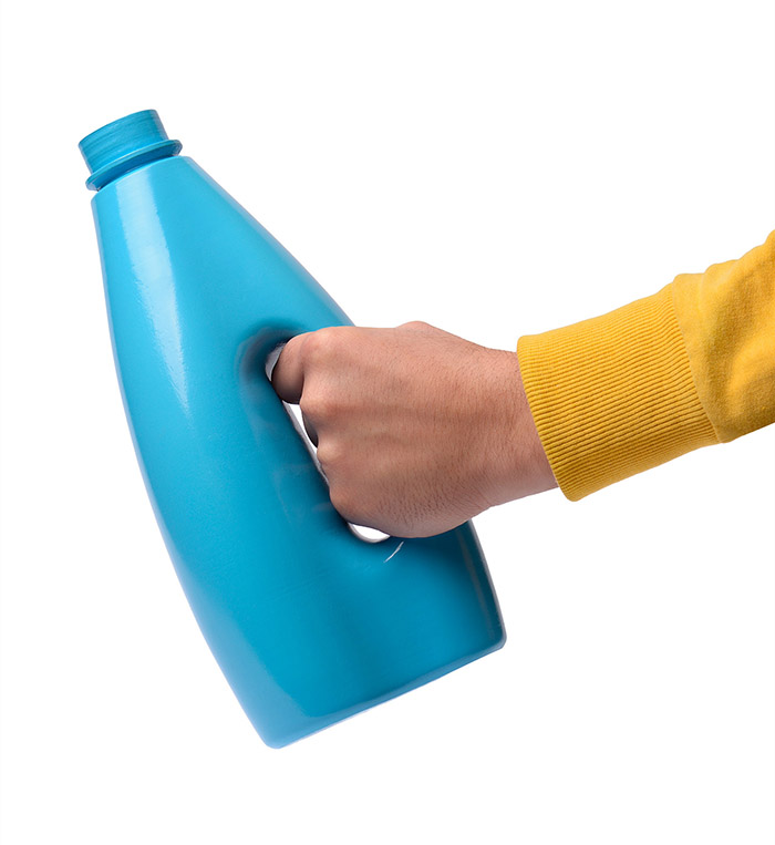
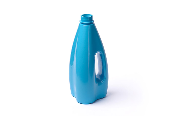
Due to its shape the bottles puzzle with each other, thereby economizing much space grouped inside the container. The bottle is founded on the basics of the equilateral triangle. Almost each part of it is solved in geometrical plasticity and all this give the bottle an organic shape and make it pleasant to the eye. No size, ratio, line and circle are accidental. Even the label of the bottle has a unique construction, obeyed to geometrical equality. Because of the uneven bottle surface, there could be no label sticked right on the bottle. Considering this, we developed one, which exactly fixes and blocks on a certain part of the bottle without any glue. The label with its wavy lines repeat the plasticity of the bottle shape and create a fusion with it.
Credits:
Client: SIS Natural
Design: Stepan Azaryan
Photography: Backbone Branding


Featured on Package Inspiration
We are young team which works to inspire packaging designers every day! Our team select the best packaging of today and shares with you.
