
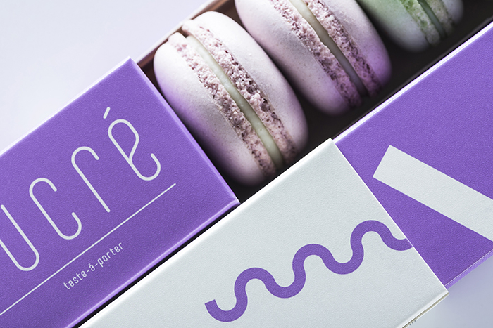
Sucré – is not a brand. This is something very personal, emotional and sincere. It is an area of a cosmopolitan woman. She is educated and confident. Refined, but also not afraid to be flirtatious like the fashion world. Confectionery and fashion is the only weaknesses, which she allows to enjoy herself openly. It is not surprising that this experience of taste is accompanied by the slogan “taste-à-porter” the art of living tasty. And the axiom “less is more” has high standards in the world of pastry and is added in a sense “less, but tastier”.
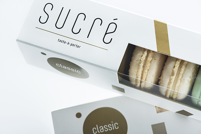
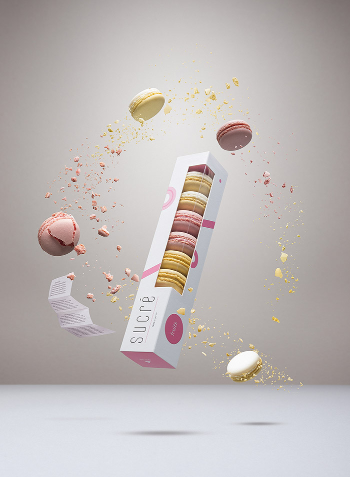
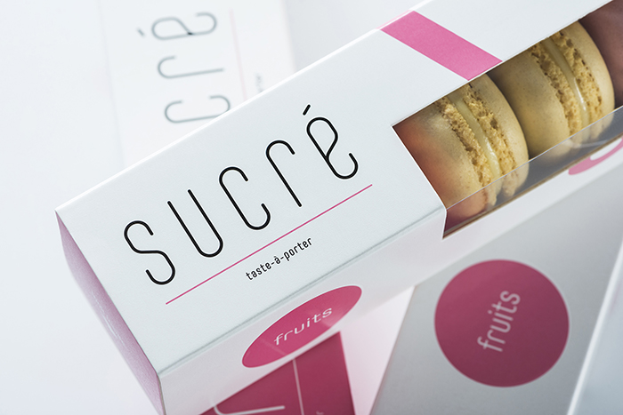
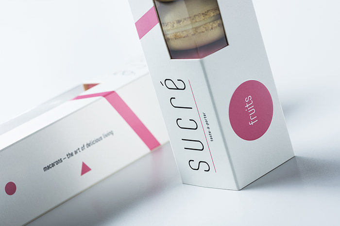
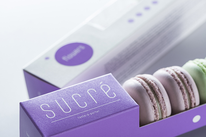
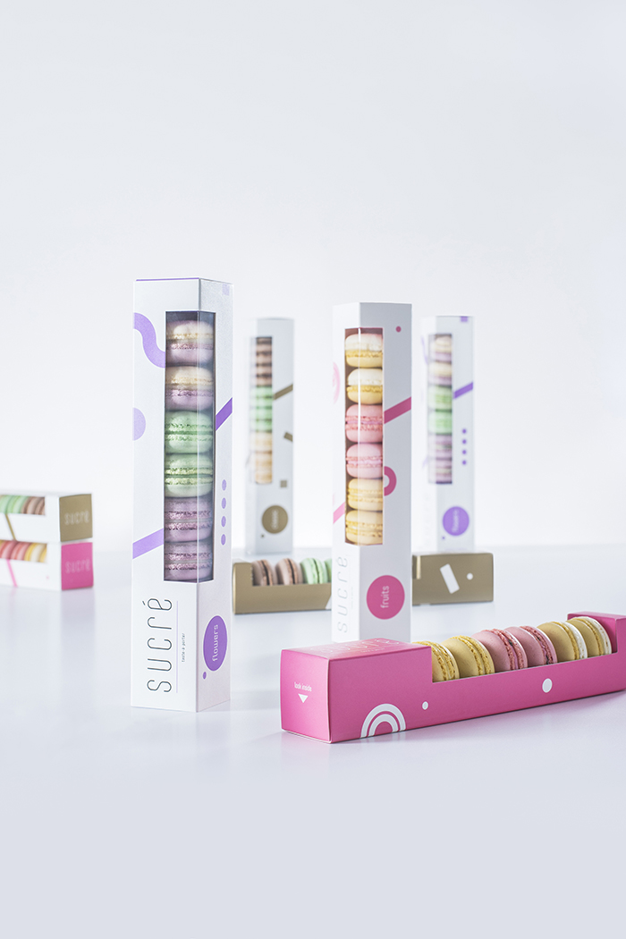
Over the past few years, small and colorful macaron cookies became popular in Lithuania. So we started telling the story of Sucré confectionery exactly from them. The collection of Sucré macarons consists of three lines of flavors. Classic flavors: champagne & brown sugar, pistachio with chopped nuts, sweet tonka beans. Fruit tastes: refreshing lemon, juicy strawberry & thyme, exotic passion fruit. Floral tastes: dizzy lavender, cool mint, sweet lilac.
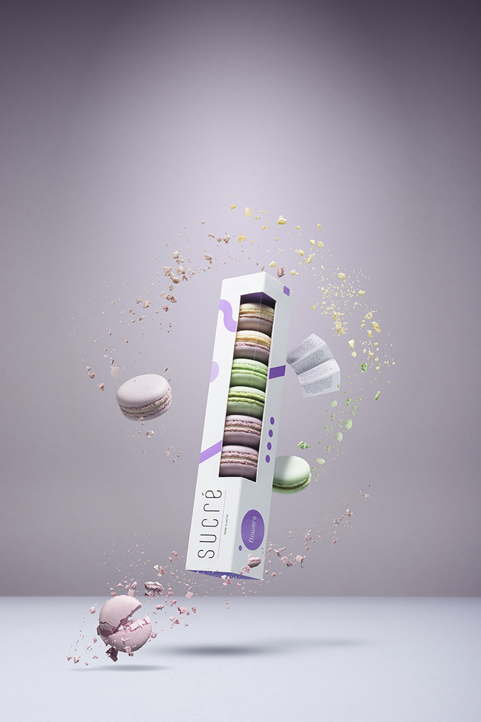
We started building packages using the case study and the searches of appropriate construction of macarons. Confectionery is mostly shared with friends or it must be considered as a gift. It is important that the process of unpacking turned into an adventure, to make part-used cookies convenient to store on the table, and the rest of the package to remain attractive. That is how we came up with the idea of a double packaging solution which looks like two-layered dresses.
We have developed individual and associative the schedule of geometric shapes for three packaging lines corresponding to different lines of colors and flavors of macarons. This design was inspired mainly by the artists of suprematism and constructivism whose influence is felt in abstract art in later times, including – minimalism and especially the currents of contemporary fashion.
Seeking the additional sensory experiences, special attention was paid to board which also has its effects of coloring and printing. White minimal packaging has a difficulty in achieving a pleasant touch and effect of visibly attractive uniform surface. In cooperation with the publishing house we discovered the possibility to cover the packaging in coarse texture hybrid lacquer. It was chosen on a bright Pantone colors for the graphic elements. Some graphic elements, which do not change, were additionally applied by a high-gloss, making the logo and the taste of the line prominent referring to the embossed circle.
Finally, in order to strengthen the emotional connection with customers, we wrote a letter on behalf of the Sucré. We printed it on translucent paper and put into a box as a small feminine secret.
Sucré macarons was launched on september 2014.
Brand concept: Raimonda Kirpliukaitė & Edvardas Kavarskas
Logo & package design: Edvardas Kavarskas
Photography: Kernius Pauliukonis
Postproduction: Robertas Gaudiešius / www.packshot.lt
Lithuania


Featured on Package Inspiration
We are young team which works to inspire packaging designers every day! Our team select the best packaging of today and shares with you.
