–
Designed by: Tried&True Design, New Zealand.
–
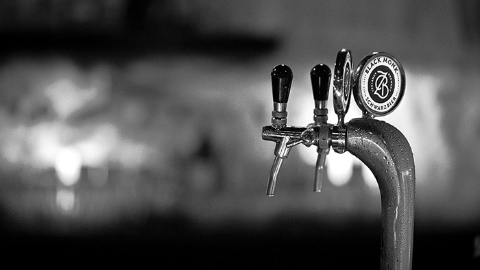
ZEELANDT BREWERY – craft beer
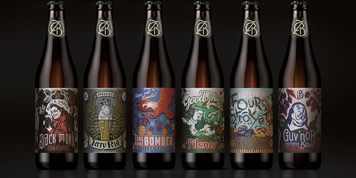
Established five years ago, this small, independently owned Hawkes Bay craft brewery had a reputation for making good beer, but were over-looked in a category that was very experimental and full of ‘zany’ looking labels (client descriptor). The brief from Chris at Zeelandt was quite simply to create a brand, which reflected the ‘true to style’ story of each brew and say ‘pick me up’.
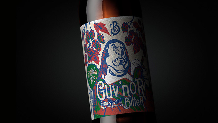
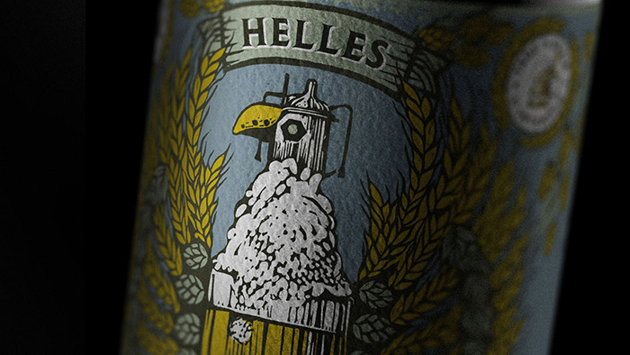
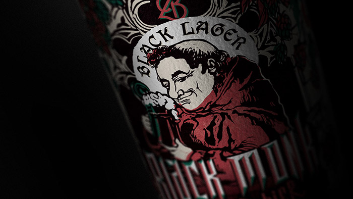
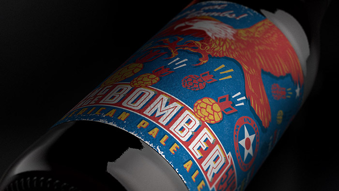
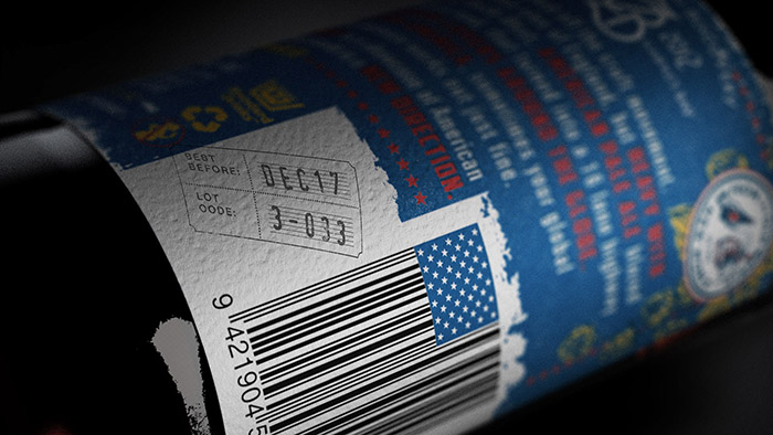
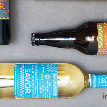
What we were given to work with: traditional European beer name (Helles, Schwarzbier), a brief explanation on where the beer originated from and tasting notes. From there our first step was to find out a bit more about what made each beer unique, its history, the story behind who created it, or what they were doing at the time. For Zeelandt, it was really important that each beer was authentic and true to style yet somehow brought to life with a bit of New Zealandness thrown in, after all that’s what made these traditional beers different. Along with the development of each story, we created new variant names for each brew that were easier to pronounce and far easier to remember (try pronouncing Schwarzbier after you’ve had a few).
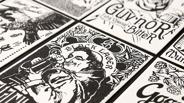
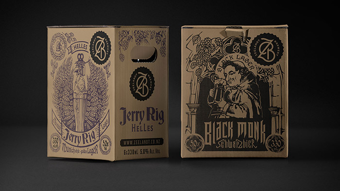
Once each story was written we created unique images for each brew bringing the story to life visually. The consistent woodcut style enabled us to tie together a diverse range of images and stories into a distinct range. With small independents, budget is always a big consideration, so we were constantly looking at ways to extend and reuse the illustrative assets. The outer cartons are a great example, we took the original illustrations and redrew them to work as single colour illustrations – solving two problems in one…. a cost effective solution that delivers strong variant differentiation in-store.
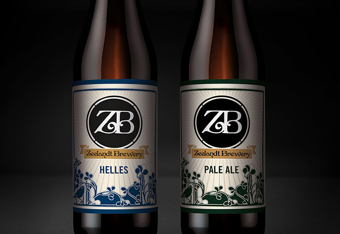
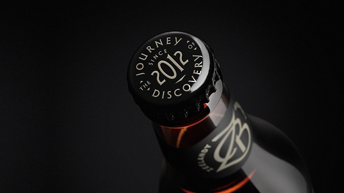
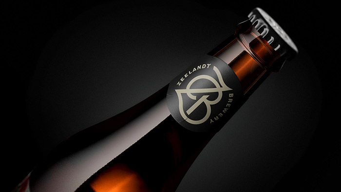
The brand mark (originally just ZB) was evolved to work better in isolation and across all brand assets. We created a more unique monogram by integrating the Z & B into one unified brand-mark and brought in the full brewery name, so when seen in isolation (away from other touch-points) it was obvious that ZB was a brewery. Simple but effective.
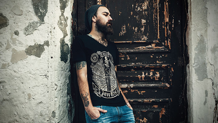
Having a strong look & story for each brew has enabled us to extend the brand across many touch-points – from stationery, livery, clothing, packaging, beer taps, trade material and in-store POS. Each piece tells it’s own story, but each has Zeelandt’s original stamp on it.
Life a local non-profit organisation came to us to update their brand identity. Their existing brandmark was dated and visually didn’t represent the current or future vision of the brand which was about connections, being people focused and inclusive. The church arm represents about 70% of the business which is complimented by three other key focus areas (Community, Business & Kingdom). Within each of these areas there are a broad range of events, programmes and developments. One of the key design challenges was how could we create a unique brand identity that has the flexibility to work across such varied touch-points, while at the same time having a design system that links them.


Featured on Package Inspiration
We are young team which works to inspire packaging designers every day! Our team select the best packaging of today and shares with you.

