
Gana Chocolate was a very challenging project. We had to create a whole new identity for an artisanal chocolate brand — the name, the slogan, the logo and the all graphic identity around it.
The chocolatier had no idea about what she wanted for the brand, but she was pretty sure about one thing: she wanted to make good chocolate.
We came up with a name that would enhance the passion for chocolate. In Portuguese, “Gana” means eagerness or the longing for something, and it also means Ghana, the country which is one of the world’s largest cocoa producers.
We knew the visual image would have to reflect this eagerness, the owner and chocolatier’s spirit— calm and introverted but with a strong passion for chocolate — and that would have to simultaneously communicate quality, artisanal skills and local production.
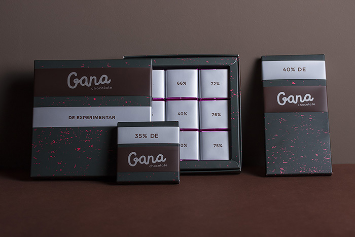
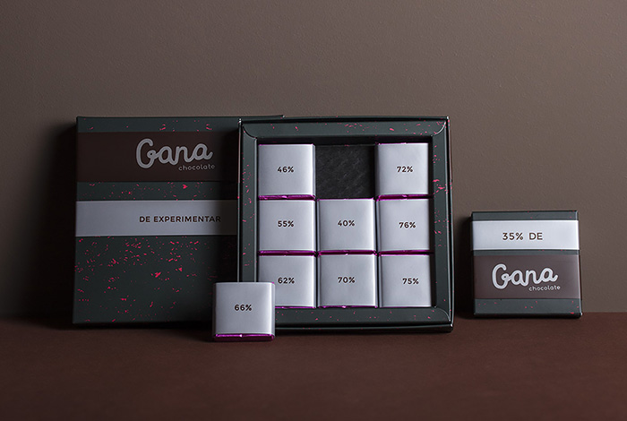
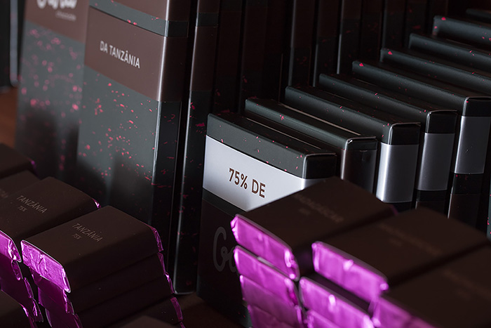
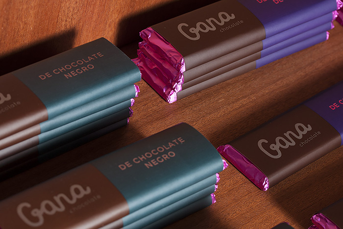
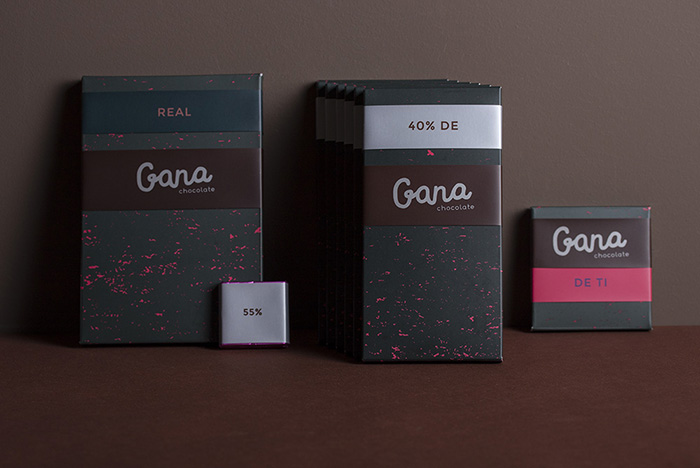
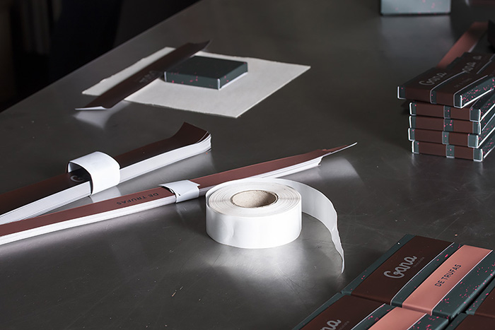
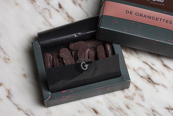
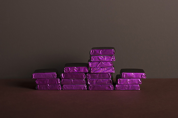
Since it was a start-up we also knew that we had to find a way to have great packaging but cost-effective. Therefore we created a system of stripes.
One stripe goes with the logo in every box and another stripe goes with the flavour or an extra message. These stripes can be attached to any box size, allowing the chocolatier to play with different options without having to produce new packages every time she wants to try a different flavour.
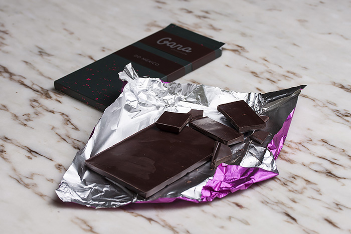
The colours are related with the different families of flavours used in the Gana chocolates, and the pattern resembles little pieces of crumbling chocolate.
The whole packaging collection invokes a gut feeling around chocolate, as expressing a latent desire through its dark aspect with sprinkles of bright colour.
Designed by: Estufa, Portugal.


Featured on Package Inspiration
We are young team which works to inspire packaging designers every day! Our team select the best packaging of today and shares with you.