Gelato is a new ice cream brand producing by “Rud” Company. The product is known for its unique benefit – soft consistency inherent to bulk handled assortment and wide range of eccentric tastes.
The project team was set up a task to create a package design concept that would:
1) make this product stand markedly out of the other ones in category concerned;
2) lay emphasis on the variety of the product line and originality of each type;
3) have a potential for development in terms of the other package types and communication materials;
4) outline position of the producing company as innovating and trendsetting among the others in the given branch.
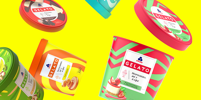
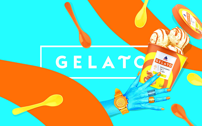
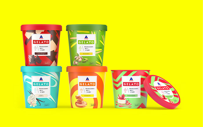
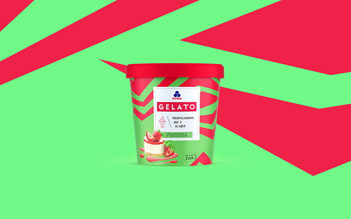
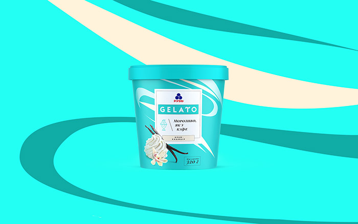
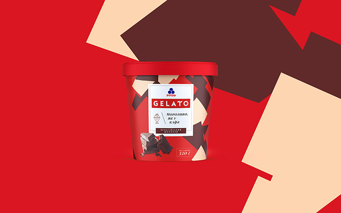
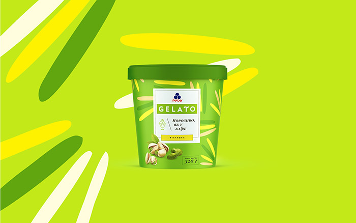
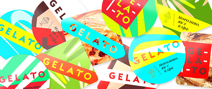
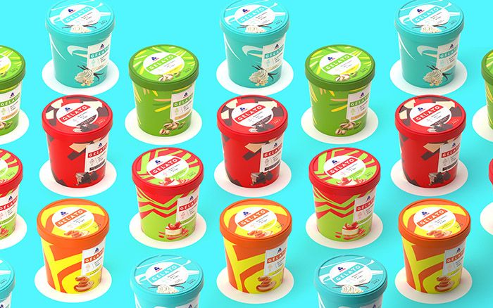
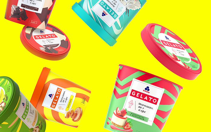
We have created cover design adhered to the principles mentioned above: brand logo and name itself in the centre of the composition styled as a handmade ice cream label. The pride place has gone to a slogan Ice cream same as in café as the studies figured that it is just how consumer identifies bulk handled ice cream types.
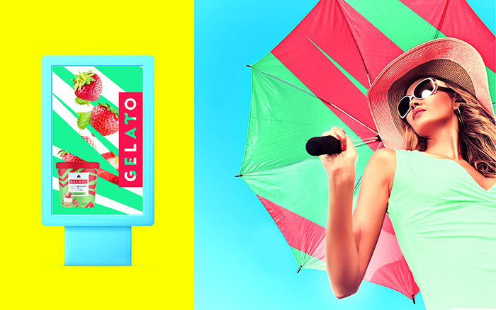
Each type is represented with contrast and dynamic design patterns, thus giving accent to ice cream tastes and separating specific features to every item in the product line. Thus, when lying side by side within refrigerator, they stand out sharply among dozens of standard categorical designs.
Designed by: Doris Advertising, Ukraine.


Featured on Package Inspiration
We are young team which works to inspire packaging designers every day! Our team select the best packaging of today and shares with you.


