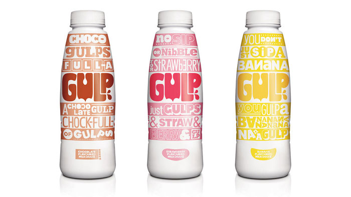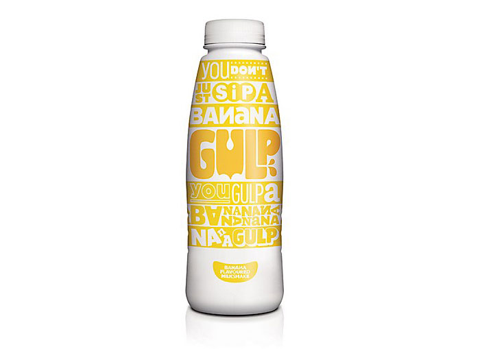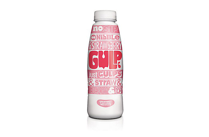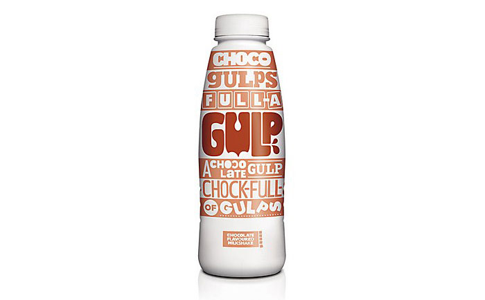
Every wonder how to illustrate the word gulp? Well W+K London has just done that with Gulp Milkshake! It’s beautiful typography style illustrates the sense that you’re gulping down large amounts of milkshake! Read about W + K London and how they achieved there design execution on Gulp Packaging after the jump!
“Gulp isn’t just a name—it’s an attitude, a way of behaving,” says Hanne Haugen of Wieden + Kennedy London. “You don’t just sip a Gulp, you gulp a Gulp.” When branding this new line of milkshakes, the agency focused on packaging and created a design that lives and breathes the Gulp philosophy. Using fun messaging, a bespoke “shaken-up” typographic style, bold colors and big stripes, W + K fashioned a range of iconic bottle designs that bring a fresh new approach to a somewhat tired category.”
Designed By: W+K London, England.


Featured on Package Inspiration