
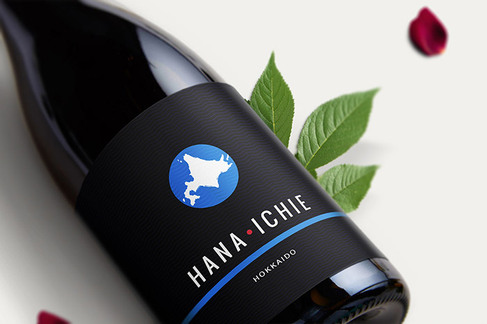
Hana Ichie / Sake Label Design
For a leading Japanese bar chain “Hokkaido” (北海道).
Client: Colowado MD
Profile: Spirits & Drinks
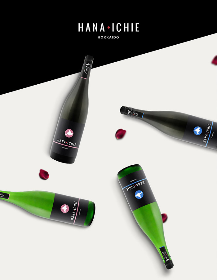
“Hana Ichie” (花いちえ) Sake is sold only at Hokkaido bar chain. There are over 60 “Hokkaido” bars in Japan, which serve local food in Northern Island in Japan, Hokkaido. The name of Hana Ichie came up from the Japanese phrase “一期一会” meaning “Treat each other trustworthily cause meeting the same person twice is never happens twice”.
About the product: Sake is purely made from rice & rice malt, however it has fruity flavor and rich aroma.
To be sold as stylish Sake, as if a person is having a wine. To be sold by glass (made specially for sake).
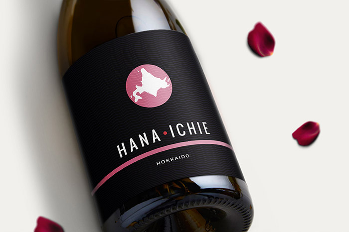
Design: Most of the sake label designs are old-fashioned, traditional Japanese brush strokes in black with white background. Hana Ichi design had to be modern, stylish, closer to a wine label. To stand out to customers and might be choosen for the label.
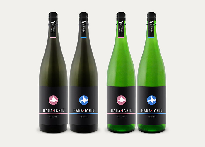
Colors: Dark label with accent colors for different sake flavors in each season.
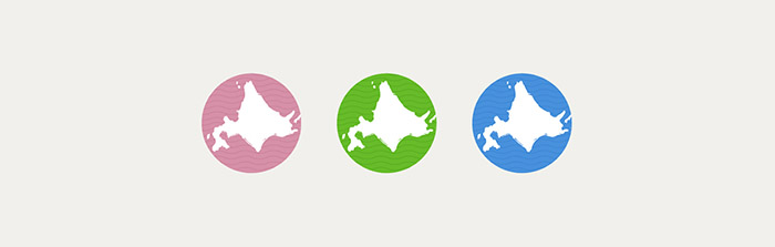
Motifs used on the label: Japanese flag, Hokkaido Island motifs (ocean waves, grassland and a shape of Hokkaido island)
Designed by: Ana Popova, France.
Featured on Package Inspiration
We are young team which works to inspire packaging designers every day! Our team select the best packaging of today and shares with you.
