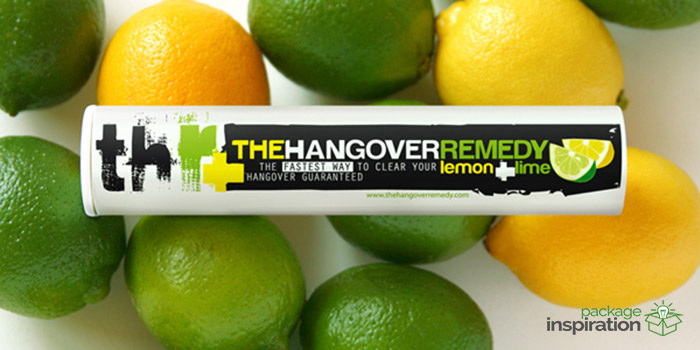
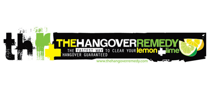
It has developed identity and packaging design for the new remedy beverage made on the basis of lime and lemon, called “The Hangover Remedy”.
The new brand has been positioned by manufacturers as an attribute of youth lifestyle, oriented on the students and frequent visitors of the nightclubs from 18-30 y.o. It was made in order to detoxify and maintain the body in the “morning after”, but doesn’t have that boring “medical” feature among the brand’s values.
The design concept of the logo and packaging were built around the product message. Since the core ingredients are vitamin C, lime and lemon, known for strong antioxidant features, the refreshing yellow-green color palette was chosen for branding color code, while the icons of citrus highlighted the the healthy message. Pretty long brand name was written in different fonts by sweeping brush strokes and a clear, readable one in order to create the strong effect of “before and after” that this brand offers to the consumers.
The back side of the label is also a tab because there is a special letter (where the name comes from) for the buyer to read.
Designed by: Bogdan Kravchenko, ISKRA Branding Agency, USA.


Featured on Package Inspiration
We are young team which works to inspire packaging designers every day! Our team select the best packaging of today and shares with you.
