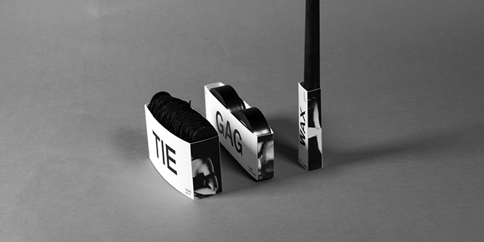
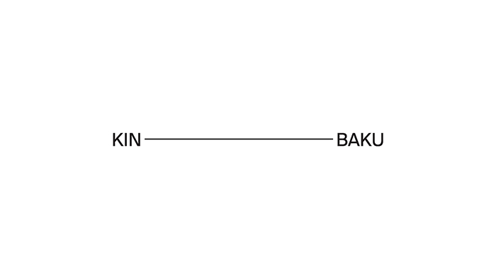
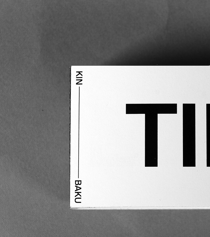
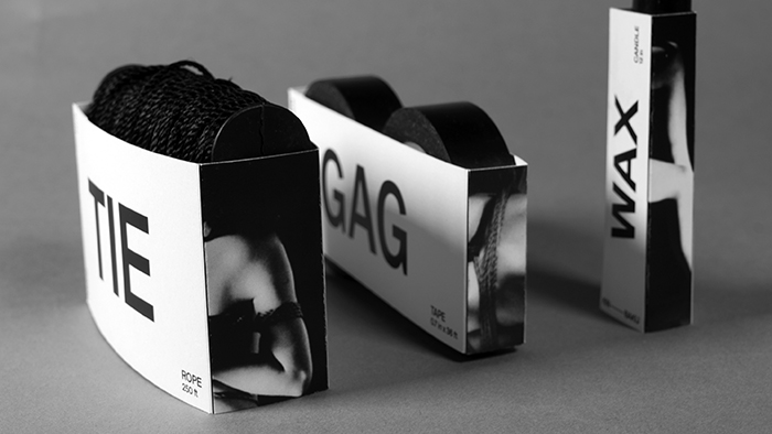
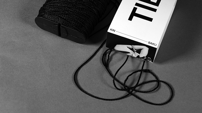
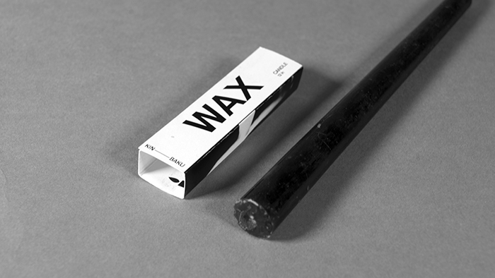
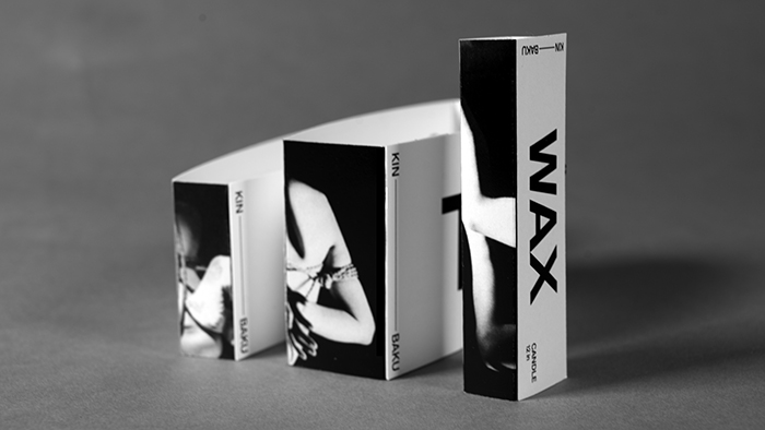
An identity and package design of KIN—BAKU, a brand specialized in bondage tools. The name KIN—BAKU came from a Japanese word ‘Kinbaku’ which literally means the beauty of binding. To alleviate the pleasing experience of bondage, simple and bold typography and photography were used.
Identity Design, Package Design, Art Direction
Designed by: Woojin Chung, USA.
Project — KIN—BAKU Package Design
Client — Student project at School of Visual Arts
Instructor — Scott Buschkuhl

Featured on Package Inspiration
We are young team which works to inspire packaging designers every day! Our team select the best packaging of today and shares with you.