MOK Specialty Coffee Roastery & Bar is a fast growing specialty coffee roastery and is now one of the leading micro roasters in Belgium. They were in serious need of a new and more professional look that reflects their status and quality as well as attract international clients.
In close collaboration with Jens Crabbe, founder of MOK, I looked at how the brand image can be further improved: altering the baseline, changing the tone of voice, as well as choosing the right materials for the new packaging.
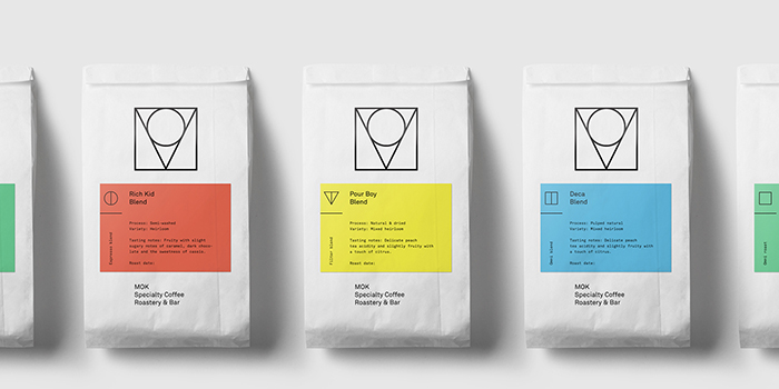
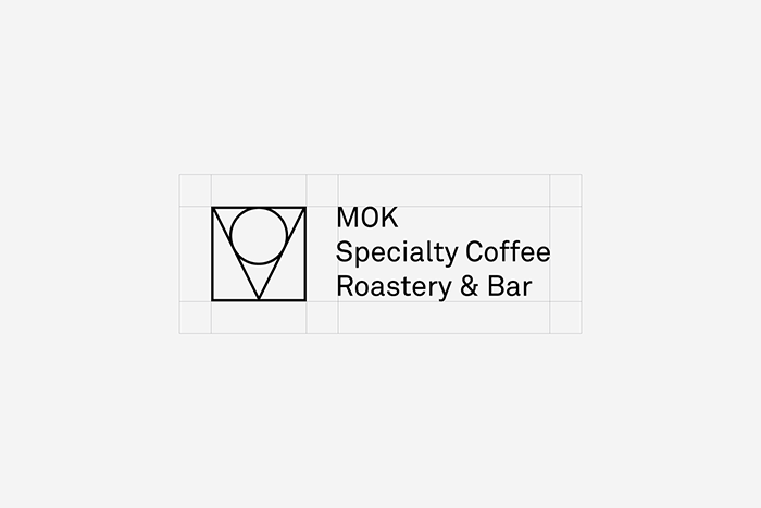
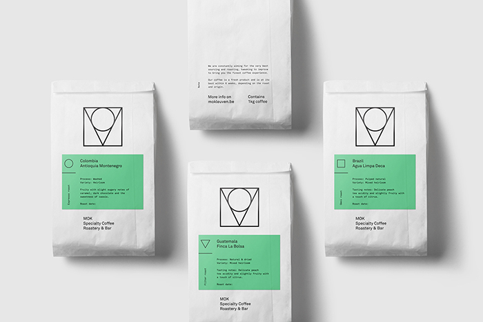
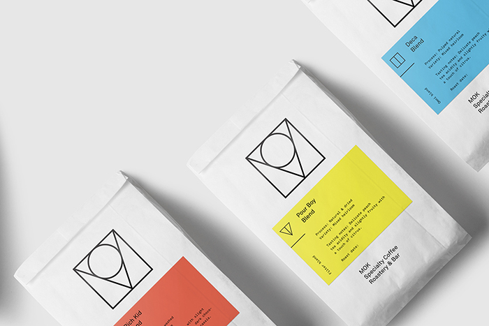
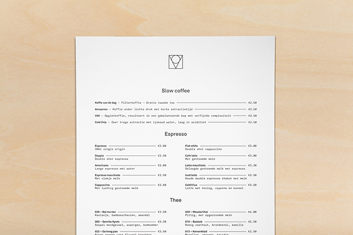
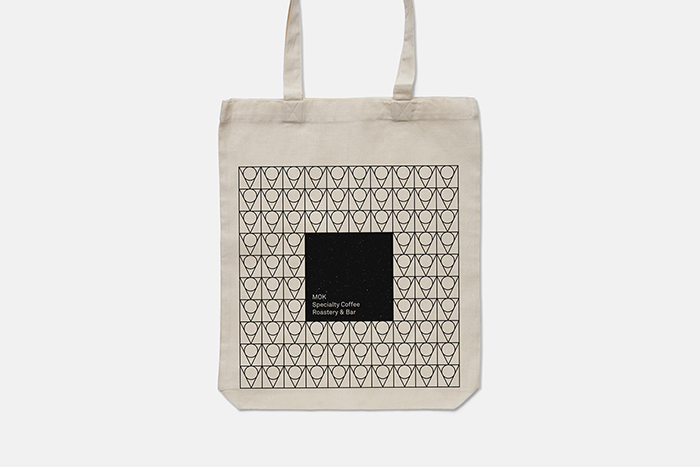
The new logo consists of an abstract monogram with the logotype aligned next to it. The monogram can be used seperately or as a pattern for promotional material. The MOK logo can be dissected into the three primary shapes. These shapes are assigned to the different types of coffee: Espresso, Filter and Omni roast, respectively. Colours are used to further emphasise the coffee types: Single origin and blend types, making each easily recognisable.
Product shots will follow soon.
Designed by: Matthias Deckx, Belgium.


Featured on Package Inspiration
We are young team which works to inspire packaging designers every day! Our team select the best packaging of today and shares with you.

