
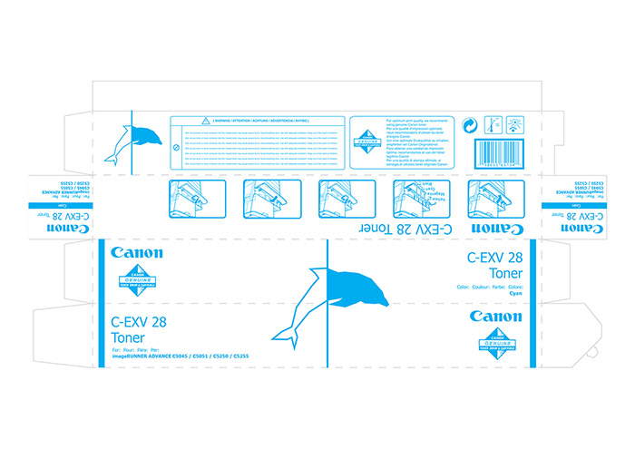
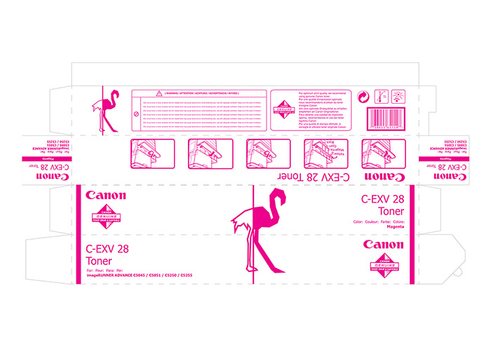
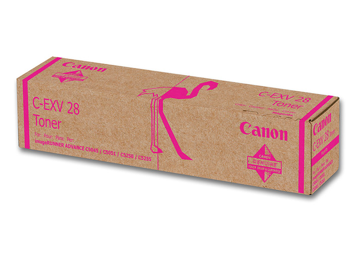
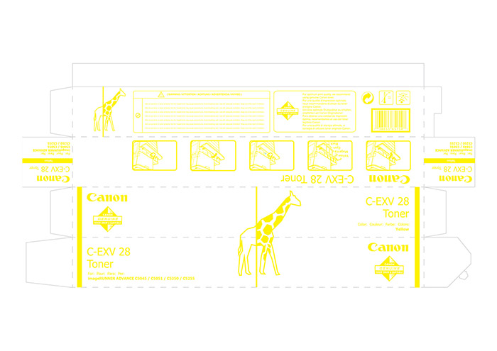
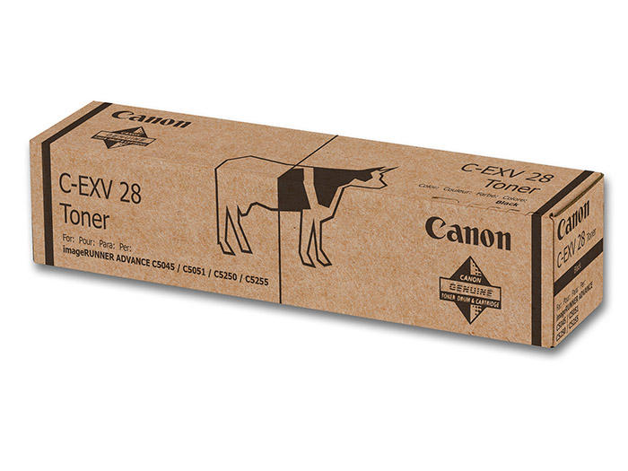
This is a project I have been working in the Packaging lesson at BAU, Escola Superior de Disseny de Barcelona this semester. The briefing was to redesign a toner packaging, and present it in the four different colors CMYK. Tired of the boring and average packagings, I tried to flip it and convert them to something interesting, ”beautiful” and still practic. The concept is the change of quality when you use Canon inks. The line between color, and REAL COLOR, using some animals to explain that change when you use Canon.
Designed by: Carlos Rollán, Spain.


Featured on Package Inspiration
We are young team which works to inspire packaging designers every day! Our team select the best packaging of today and shares with you.
