
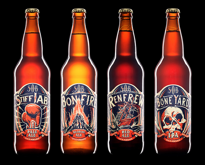
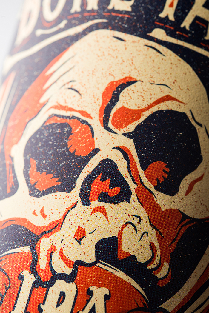
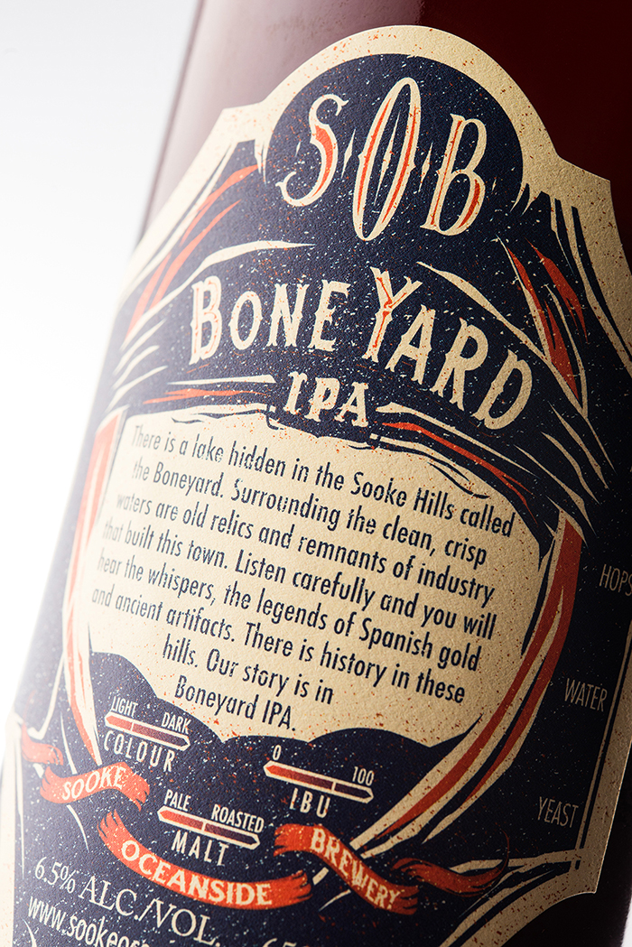
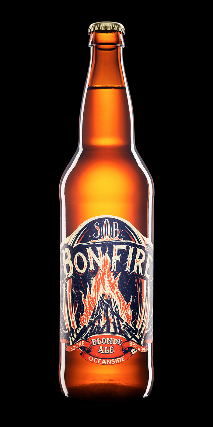
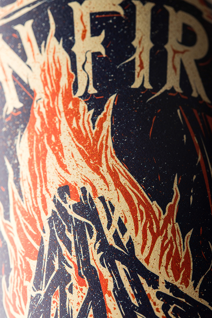
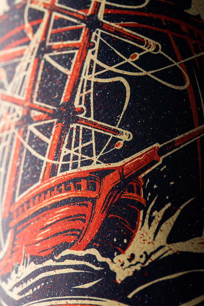
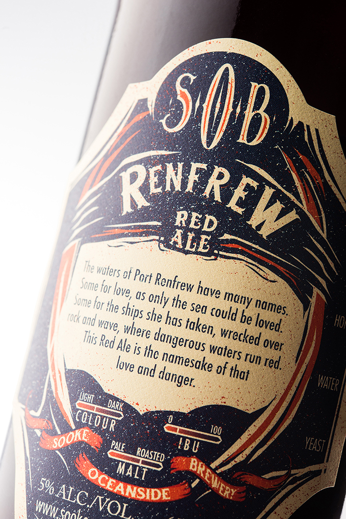
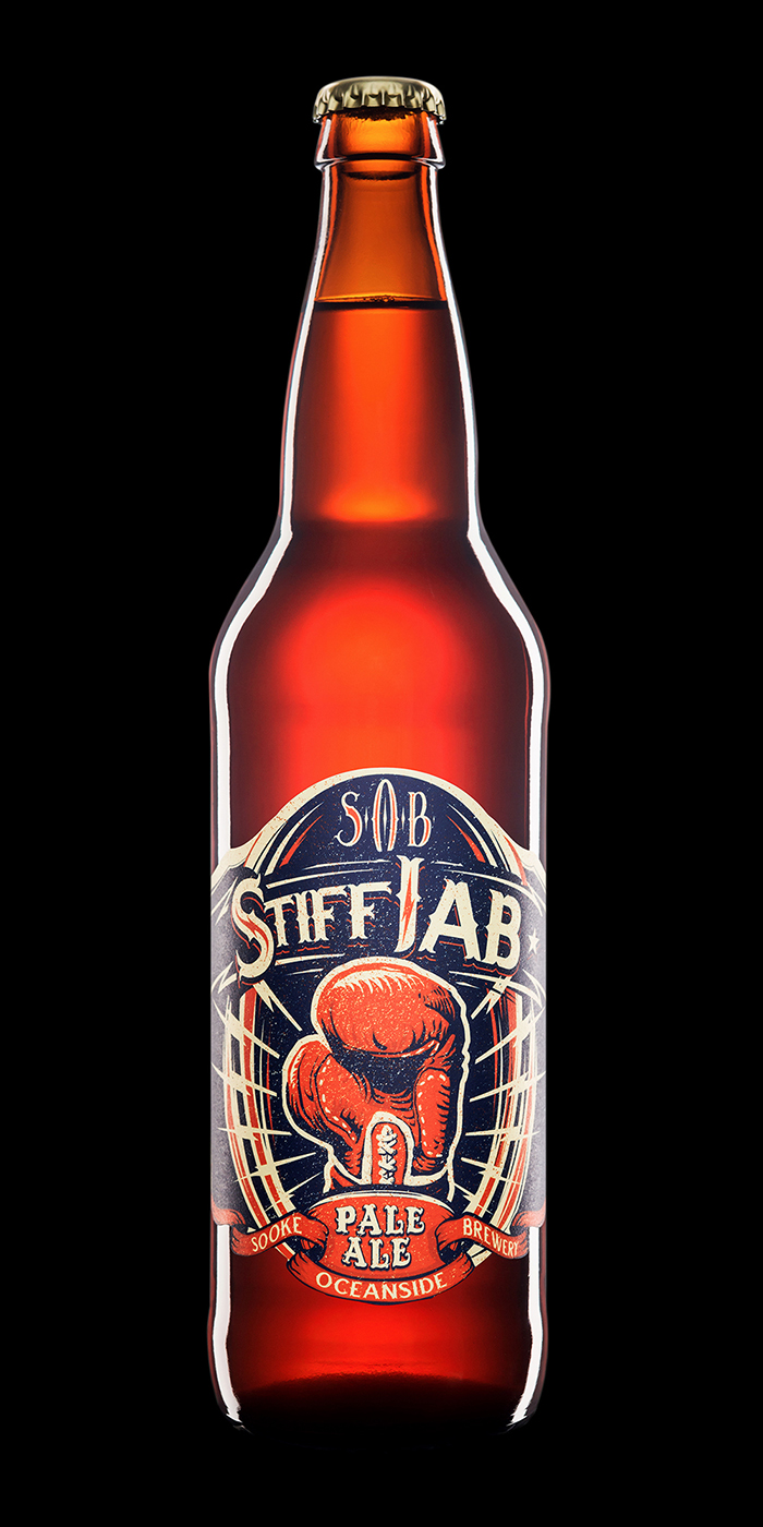
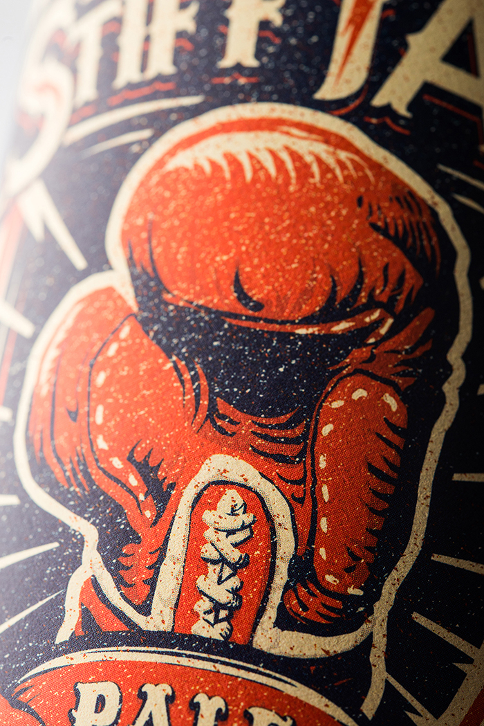
For Sooke Oceanside Brewing, we were tasked with creating a brand world centred around a lineup of products with strong family resemblance, yet with enough flexibility to allow for custom illustrations for each product. We decided to unify the brand with a bold, graphic approach, drawing on the aesthetics of barber shops and advertising art from the 1930s. For the label design system, we developed a hybrid approach: some of the framing and secondary design elements are consistent across the lineup, while others correspond to the iconic, central illustration. Custom typography, for example, is harmonized across the product lineup by letterform, and unified within the individual label by ornament. The labels all come together with a decorative die shape and an eye-catching colour palette.
Designed by: Hired Guns Creative,Canada.
Printer: Tapp Label
Phototgraphy: Sean Fenzl


Featured on Package Inspiration
We are young team which works to inspire packaging designers every day! Our team select the best packaging of today and shares with you.
