
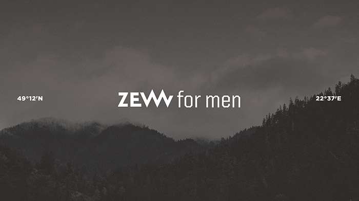
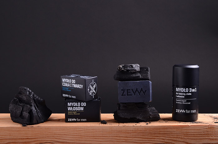
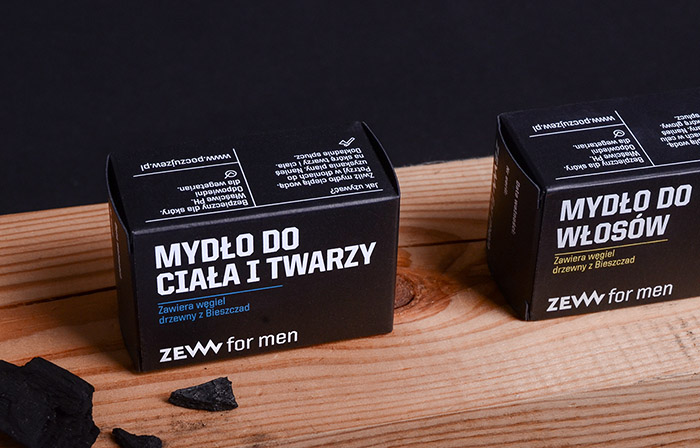
ZEW for men
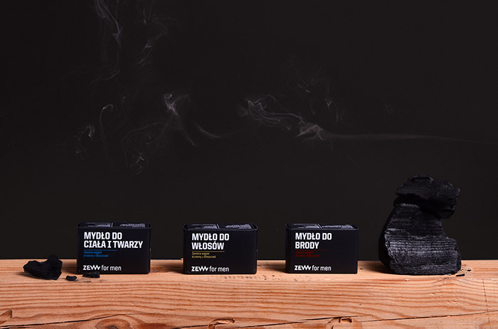
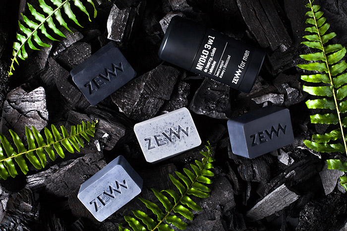
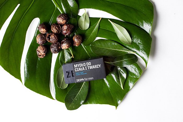
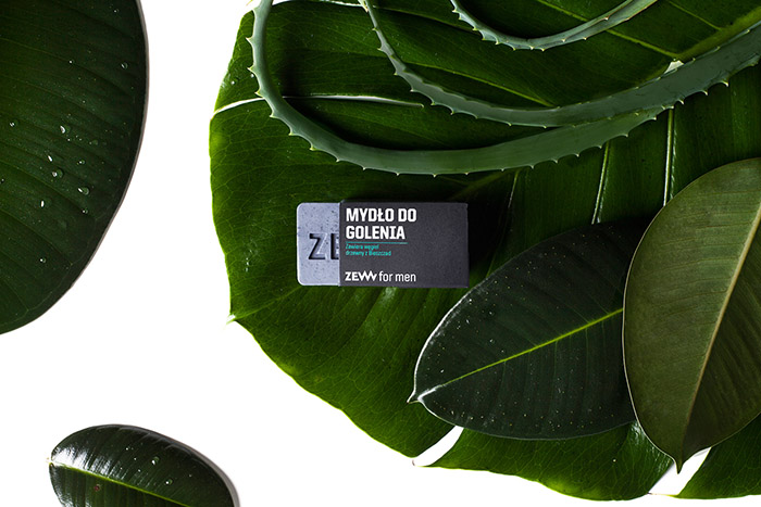
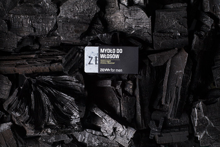
is a series of natural cosmetics based on a charcoal from Bieszczady mountains. Currently the series contains of four soaps and a soap stick with a characteristic grey colour coming from the main component. Our task was to design the packaging so that it would communicate: strength, naturalness, masculinity and active life.
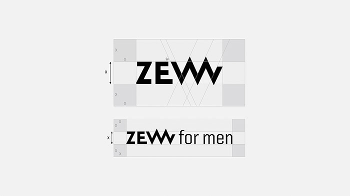
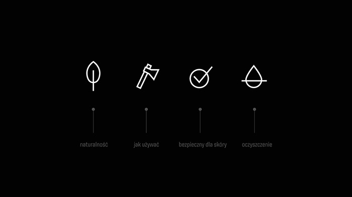
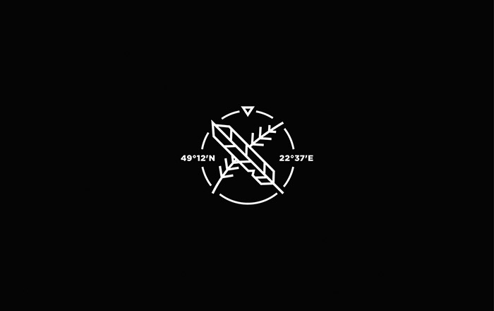
We decided to use black and characteristic typography, which makes for an impactful packaging. Letter ‘W’ in the brand’s logo refers to a mountain shape – another interpratation can also be a canine giving the mark some edge. An important element for the line is also a signet with a feather element and geographical coordinates showing where the important ingredient – Bieszczady charcoal – comes from.
Designed by: Mamastudio Design Agency, Poland.


Featured on Package Inspiration
We are young team which works to inspire packaging designers every day! Our team select the best packaging of today and shares with you.
