Designed by: AVC, Belarus.
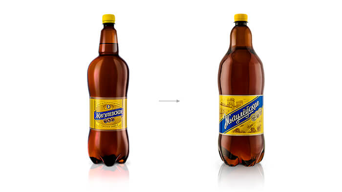
The redesigned label of “Zhigulevskoe” from “Bobruisk Brovar” is designed to brighten the brand on the supermarket shelf and to update the look of the product. At the same time, it was important to save the recognition and character of the brand beloved by many.
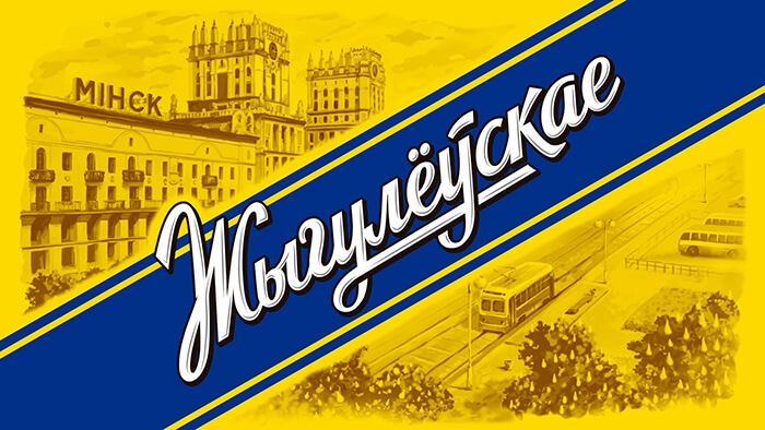
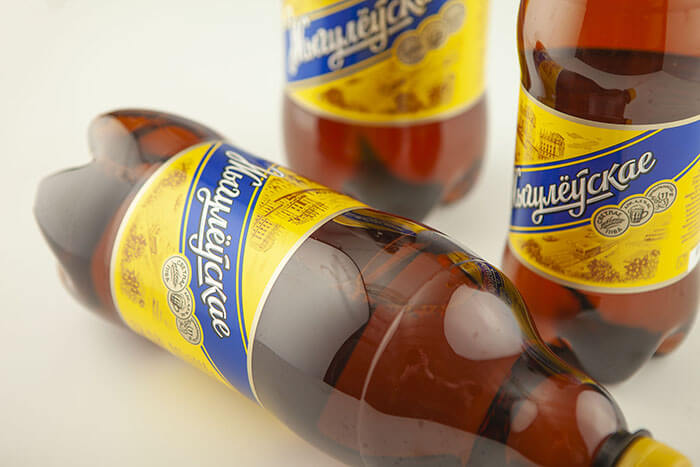
The style-forming constants were rethought – the corporate yellow background as well as the logo on the blue dice. The colours have turned brighter, which sharpened the contrast. This added the necessary boldness to the packaging. Moreover, the diagonal position of the logo acts as a special effect to make the logo more noticeable.
The heraldic elements, which are not quite relevant to the spirit of the times, were replaced with an engraving depicting Minsk in the 70s. Together with the stained-glass font, it supports the necessary nostalgic mood. The reference to Minsk and the translation of the label into the Belarusian language emphasize the Belarusian origin of the product, which for many customers is a sign of quality.


Featured on Package Inspiration
We are young team which works to inspire packaging designers every day! Our team select the best packaging of today and shares with you.
